The 'main picture'
advice for making the most of your main picture
Part 3 Adding images to the web page
You can add photographs or any image file to the webpage you have created. Most digital photographs are too large to load quickly on a website and should be resized, typically to 1200x800 pixels. You can do this in an image processing software, however if you are doing this frequently it may be useful to download a “image resizing” utility app
Step 2 - Adding Main Picture
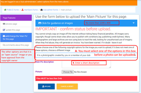
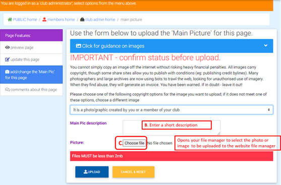
You can choose to upload a 'main picture' to the file manager - or you could have done this before step 2. Pictures are displayed in a variety of places and help make your pages more attractive. Please observe the size restrictions on the pictures uploaded. Smaller file sizes allow quicker display of the pictures on the device
Fill in the title and Description boxes, the Title should be around 35 characters and the Description no more than 175 characters, for optimal display on all devices (from large screen computer to mobile phone)

The “Description” field is to give a description of the picture, which is helpful for partially sighted or blind visitors using a screen reader; it is also helpful for search engine rankings
The Blue “Image Guidance” box states
“Have a good image to be the 'main picture'. This should be 1200 x 800 pixels in jpg format.
Landscape format pictures display much better than portrait. DO NOT USE PORTRAIT IF USING THE CAROUSEL ON YOUR HOME PAGE
Before you upload it, change its name so it is meaningful, e.g. Conwy_Rotary_community_service_2015.jpg NOT p1864356.jpg - this will also help in search engine results.
The image name should be alphanumeric and _ or - ONLY - NO symbols, parenthesis, punctuation or anything else! Preferably without space in the name.
This image is used in menus and forms the first image in 'slideshows' if you create one later.
IMPORTANT - the upload will fail if the image is too large. You will not get a warning about the size.
IF YOU ARE USING THE FULL-WIDTH CAROUSEL (rather than 'thumbnails') on your homepage, you need to be more selective in your choice of image (see the pdf guide);
- keep the subject fairly central
- keep plenty of space around the edges
(This is because the carousel displays differently on phones/tablets/PC - you may want to download an image from the image gallery and use that for your main pic, as these display properly on all devices)”

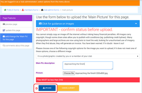
Then don’t forget to upload!

For addiional images, see the page on creating 'slideshows'.